Posts

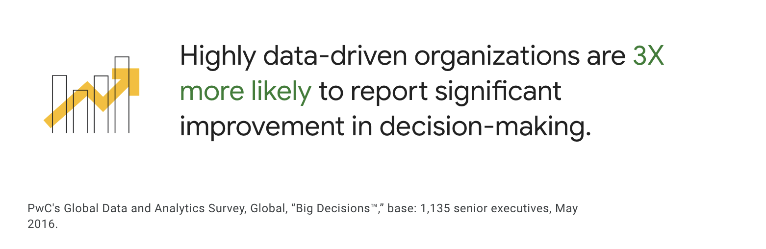
How Visualization Software Betters Data Interpretation in Real-Time Analytics

Image
  Have you ever wondered how a high-end business like Edit Suits Co. , known for its made-to-measure menswear and exceptional customer service, keeps up with the fast-paced demands of the fashion industry? How do they manage sprawling operations across continents while ensuring every customer feels uniquely catered to? Imagine being able to see your business data unfold in real time , turning every piece of information into an opportunity for growth. How dynamic would that be for your business? Patrick Jungo, the co-founder of Edit Suits Co., faced a similar dilemma. With operations split between London and Singapore, the challenge wasn't just about managing teams or inventory—it was about harnessing and interpreting scattered data efficiently to make informed decisions swiftly. As the business grew, so did the complexity of managing data from various sources.  "Information started to become more scattered,"  Patrick noted, as he realized the pressing need for a

5 Data Visualization Techniques You Aren't Using But Should

Image
  Founded in 2011, RedShelf strives to simplify access to digital content for readers everywhere. But as RedShelf CFO & Co-Founder Tim Haitaian discovered, managing such a massive repository of digital information was anything but simple. Data was there, but it was scattered and elusive. Have you ever felt overwhelmed by the sheer volume of data at your disposal, knowing its potential but unable to harness it effectively? This was the challenge at RedShelf.  The need for a robust, accessible, and transparent dashboard visualization platform became apparent. "We really started trying to create some sort of data visualization ourselves," Haitaian recalls. But frustration and limitations quickly set in. Can you relate to the feeling of hitting a wall with your data visualization efforts? The quest for an alternative led RedShelf to Grow—a platform that promised and delivered immediate, company-wide visualization at a low cost. Suddenly, revenue figures, sales

What If Insights Came Naturally With Data Visualization Software

Image
  The importance of data in guiding business decisions can no longer be ignored. Intuition can provide a compelling feeling or spark that points you in a certain direction; but, it's data that allows you to confirm, comprehend, and quantify your choices. Yet, how often do we find ourselves overwhelmed by the sheer volume of data, struggling to extract meaningful insights? As per a PwC survey of over 1,000 top executives, companies heavily reliant on data are three times more likely to report improvements in their decision-making processes compared to those that use data less frequently. What if, instead of sifting through complex datasets, the insights you needed came to you as naturally as breathing? Let’s hold that possibility for a while and explore if data visualization software can help us with this.  The Evolution of Intuitive Insights It is safe to say that business data visualization is about making sense of data in a way that is both immediate and insightful. This

What If Your Data’s Full Potential Was Just a Visualization Away?

Image
  Have you ever wondered what stories your data could tell if given the right voice? What if the secrets to your business's success are hidden within the numbers and metrics you glance at every day, but they just haven't been brought to life yet? This is where the art and science of data visualization come in. They turn numbers into stories that make people want to take action. But  what is data visualization exactly, and why is it the key to unlocking the full potential of your data? Humans process visual information 60,000 times faster than text , and 65% of us are visual learners. Data visualization leverages this innate propensity by translating complex data sets into visual formats that our brains can understand and analyze quickly and effectively. It's not just about making pretty pictures out of numbers; it's about clarity, comprehension, and, ultimately, about making informed decisions based on what the data reveals. Imagine you have a data visualiz

Why Most Data Visualization Dashboards Fail — And How to Make Yours Succeed

Image
74% of companies aim to be data-driven, but only 29% believe they're good at transforming analytics into action. Obviously, the role of a data visualization dashboard cannot be ignored.  But why do so many dashboards fall short of their potential, cluttering screens without helping in decision-making?  Could it be that in the rush to become data-driven , we're overlooking the art and science that make a data visualization dashboard not just functional, but truly impactful?  This blog dives deep into the reasons behind the failure of many dashboards and, more importantly, shares the secrets to creating dashboards that not only succeed but become indispensable tools in your data strategy. Understanding Dashboard Failures Lack of Clear Objectives A fundamental flaw in many data visualization dashboards is the absence of clear, well-defined objectives. Without a specific goal in mind, dashboards can become a collection of irrelevant metrics, leading to confusion and misinterpre