Dashboard Dynamics: How Visualization Empowers Data Interpretation
In our fast-paced digital age, the volume of data businesses grapple with is enormous. Transforming this raw data into actionable insights is where the real challenge lies. Enter the concept of data visualization. But what is data visualization? Simply put, it’s the art and science of representing data in a visual format, like charts or graphs. By doing so, it becomes possible to see complex data patterns, trends, and outliers at a glance. And this is where the data visualization dashboard shines.
The Evolution of Dashboards
The journey from humble spreadsheets to sophisticated BI tools is an intriguing one. As the demands of data-driven decision-making grew, so did the need for advanced platforms that could present data in a digestible manner. This evolution has birthed the modern dashboard visualization, a hub of insights tailored to ease interpretation and spur timely decisions.
Why Visualization Matters
Humans are innately visual creatures. Research suggests that our brains process images up to 60,000 times faster than text. With this in mind, the significance of dashboard visualization becomes clear. Consider this: given a dense report and a well-designed dashboard, which would you comprehend quicker? The visual representation allows for quicker insights, making the data visualization dashboard an indispensable tool in today’s business realm.
Dashboard Components and Their Impact
KPI Widgets: With real-time tracking of key performance indicators, stakeholders can instantly gauge business health.
Graphs and Charts: These elements declutter complex data, showcasing trends and facilitating comparative analysis. It's the heart of what data visualization is all about.
Maps: Especially vital for global businesses, geospatial analysis pinpoints areas of interest, demand, or concern.
Interactive Elements: Dive deep or skim the surface—interactivity ensures that users can tailor their data exploration.
How Dashboard Visualization Empowers Data Interpretation
Enhancing Depth and Dimension
Visualization adds depth to data. For instance, a simple bar chart can quickly show sales trends over months, while a heat map can depict the geographical distribution of data, offering insights that might remain obscured in tabular data. This multi-dimensionality allows businesses to extract diverse insights from a single dataset.
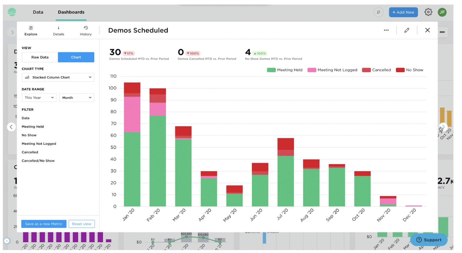
Consider, for instance, Autin's dashboard showcased in Figure 1. At first glance, the dashboard visualization provides a comprehensive overview of the business metrics. But what if a user needs a deeper understanding of a particular metric?

This is where the brilliance of the Grow’s "Expanded View" feature comes into play. By simply clicking on the expand icon located in the top right corner of any metric, users are ushered into an expanded, detailed view of that specific metric. In the case of our example, when wanting to understand more about the "Demo Scheduled" metric in Autin’s data visualization dashboard, one can easily transition from the broad perspective of Figure 1 to the more detailed landscape of Figure 2.
Interactive Exploration
One of the hallmarks of modern data visualization software dynamics is interactivity. Users can click, hover, zoom, filter, and drill down into specific data points. This interactivity empowers users to explore data at their own pace and according to their needs, moving from a broad overview to granular details seamlessly.
Grow's user-friendly setup and training ensures that the team can interact with and explore the data, leading to improved user engagement and understanding. For those keen to understand the intricacies and benefits of Grow, including its cost and unique features, check out the detailed review on Grow Reviews Cost & Features GetApp.
Contextual Understanding
Dashboards often juxtapose various data visualizations, providing context. By viewing multiple related visualizations simultaneously, users can understand relationships and correlations within data, leading to a richer interpretation.
Prior to using Grow, Redshelf’s data was scattered and not contextually linked. With Grow’s data visualization dashboard, they established a "singular source for information," ensuring everyone had a unified and contextual understanding of the company's operations and metrics.
Reducing Cognitive Load
Our cognitive load—how much information our brains can process at once—is limited. A well-crafted dashboard visualization reduces this load by presenting data in digestible chunks, organized logically, and displayed visually. Instead of grappling with rows of numbers, users can quickly interpret visual representations, making decision-making more efficient.
Forrest Derr’s, Director at Altaworx, challenge was to create customizable dashboards without the need for constant coding and changes. Grow’s BI and data visualization software enabled him to achieve this, simplifying the data representation process and reducing the cognitive burden on the IT team.
Emphasizing Urgency and Importance
With the strategic use of colors, shapes, and placements, data visualization dashboards can guide users' attention to the most crucial data points. Whether it's a red downward-pointing arrow indicating falling sales or a highlighted KPI achieving its target, visualization techniques can emphasize what's essential, prompting timely action.
For instance, The Grow dashboard's custom metric for the AR representative helped Altaworx, mentioned in the above pointer, quickly identify and act upon unpaid invoices, emphasizing the urgency of addressing this issue.
Best Practices in Dashboard Design
The perfect data visualization dashboard strikes a balance between aesthetics and functionality. Emphasizing data hierarchy ensures that critical insights don’t get lost in the noise. Color isn't just about looking good; it plays a pivotal role in guiding interpretation and drawing attention. Lastly, a user-centric design ensures the dashboard resonates with its intended audience, facilitating quicker comprehension and action.
Conclusion
Dashboard visualization is more than just pretty graphics; it's the bridge between raw data and actionable business insights. Investing time in understanding what data visualization is and how it can be harnessed can transform business strategies and outcomes.
If your current dashboard feels lackluster, perhaps it's time to leverage the capabilities of Grow’s data visualization software.
Dive deep into the world of data visualization and unlock the true potential of your business data with Grow's robust features. Not sure where to begin?
Let our expert team guide you on this transformative journey and explore the myriad features that Grow offers to elevate your data interpretation.


Comments
Post a Comment